Learning from community housing movements: Transforming corridors into social spaces
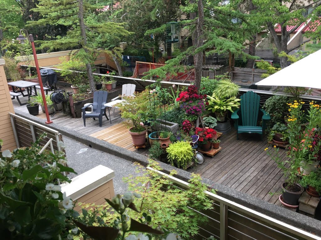
The exterior walkway at Quayside Village Cohousing features places to sit and chat, and is filled with plants.
By Madeleine Hebert, Leslie Shieh, and Emma Avery
When you picture a hallway or corridor in an apartment building, what do you see?
Hallways, entrances, and exits are primarily designed with fire safety in mind. As a result, most multi-unit building corridors are long and monotonous, and do not encourage social connection.
Quayside Village Cohousing in North Vancouver shows a different, more social possibility: the exterior walkway (pictured above) is filled with lush hanging vines, gardening areas, and places to sit and chat with neighbours. The open corridor wraps around the building’s exterior courtyard, while windows to private units along the walkway create visual connections between private and semi-public spaces. There is something inherently social and inviting about the exterior walkways. They allow each unit’s entrance to feel personalized, yet still connected to the community.
Building designers and developers are constrained by building codes, site restrictions, and budgets when designing the overall building layout. However, examples from cohousing and co-operative housing show how, with simple interventions, any corridor can be transformed into a social corridor.
In this article, we explore five design and programming strategies that developers, designers and housing operators can use to transform multi-unit building hallways into social corridors.
What is a social corridor?
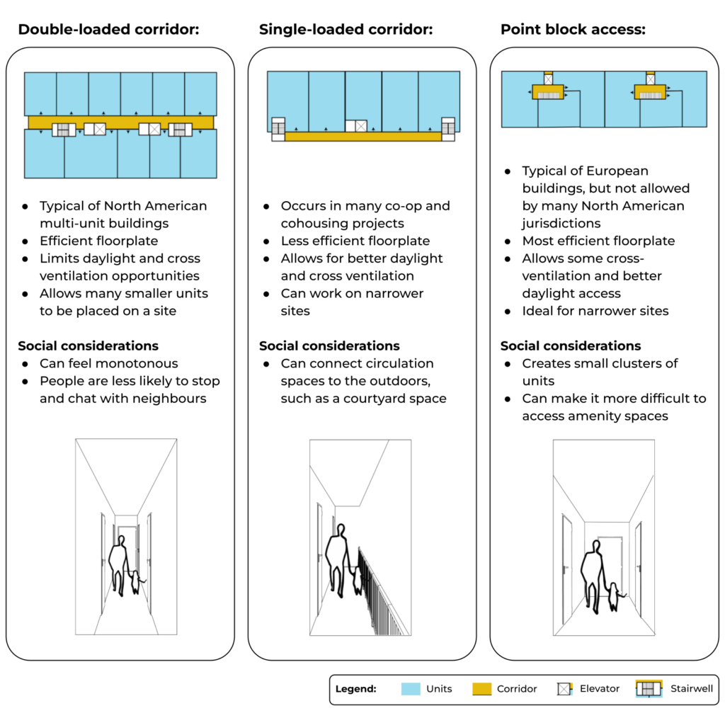
Social corridors are widened interior or exterior corridors that include permanent or flexible design and programming elements to promote social interaction. In the Happy Homes toolkit, we further explore ways to make corridors more social.
The illustration below shows the three main types of corridors found in multi-unit buildings: double-loaded corridors, single-loaded corridors, and point block access. No matter which type a building uses, there are features that builders and designers can include to transform corridors into warm and inviting social spaces.
Corridor types in practice:
Double-loaded corridor (Windsong Cohousing)
Single-loaded corridor (Quayside Village Cohousing)
Point block access style (Little Mountain Cohousing)
Below, we outline five design strategies to create social corridors in multi-unit buildings. The strategies draw from Happy Cities’ research, visits, and interviews with members of six different co-op and cohousing buildings in Vancouver, North Vancouver, and Seattle.
This article is Part 3 of a four-part series on learning from community housing movements. You can read the series introduction here, and Part 2, on the social potential of lobbies, here.
Design strategy 1: Consider exterior walkways as the primary means of circulation
Principles: Transition, co-location
Exterior walkways allow each unit direct access to fresh air, sunlight, views, and shared spaces. These elements create a walkway that feels almost like a street or sidewalk, rather than a corridor, making it inherently more social. In light of the COVID-19 pandemic, exterior circulation can also increase people’s sense of safety during times of social distancing. Finally, exterior walkways allow for through-unit design, meaning that each unit includes windows to the outside at both ends. Through-unit design is important because it increases control over social exposure and allows for more natural light and cross-ventilation.
There are two main configurations to achieve through-unit design. On a narrower lot, architects can line units up side by side, along a single exterior walkway. On a wider site, units can be centred around a courtyard with a shared walkway. Multi-unit building developers should consider that exterior walkways increase the overall building envelope required and overall floor plan efficiency. However, given the growing popularity of exterior circulation in buildings, municipalities such as North Vancouver are working to exempt exterior circulation from development area calculations (FSR) in their policies.
Putting this strategy into action:
Locate exterior walkways adjacent to a courtyard space.
Provide visual connections between exterior circulation and balconies, terraces, or common amenity spaces.
Include rain and weather protection.
Examples:
At Quayside Cohousing, exterior walkways include small nooks for planter boxes. These nooks allow residents to connect with each other and with nature as they travel to and from their units.
At Capitol Hill Cohousing, people can see the exterior walkway from their balconies, and vice versa. These visual connections allowed people to participate in activities together during the pandemic, such as balcony meals, a concert, or bingo.
At Capital Hill Cohousing, units face out on to an exterior walkway and other common spaces. Photo: Schemata Workshop
Design strategy 2: Increase the width of circulation to allow for social interaction
Principles: Transition, evolution
Increasing the width of corridors allows residents to control the distance between themselves and others. When people feel that they can control their social exposure, they feel less overcrowded and more relaxed when using shared spaces. By strategically placing widened corridors in certain areas of the building, designers can create opportunities for spontaneous social moments between neighbours, like a quick chat.
Putting this strategy into action:
Analyze the overall building configuration to identify ideal places to widen the corridors.
Wider corridors should be located in areas where people are more likely to gather. For instance, the pathway to garbage and recycling rooms is often well-traveled, and a surprising place where neighbours may socialize as they bump into each other.
Design corridors to be between 1.5 and 2 metres wide to allow people to pause and interact without impeding traffic flow.
Examples:
At Capitol Hill Cohousing, the walkways are a few feet wider than a typical corridor. This allows people to have conversations when they spontaneously bump into a neighbor.
At Athletes Village Co-op, there is an exterior covered breezeway that is a few feet wider than a typical corridor. The extra width allows residents to place tables and chairs and enjoy the views of the courtyard.
Exterior walkways at Capitol Hill Cohousing are wide enough for people to linger in, and overlook the common courtyard. Photo: Schemata Workshop
Design strategy 3: Include pause spaces, such as nooks, adjacent to corridors
Principles: Integration, co-location, heart
In a double-loaded corridor (where units line both sides of the corridor), blank walls make people much less likely to pause, because there are no points of interest. Adding small points of interest to a corridor—such as artwork, defined entryways, views, seating, or nooks—encourages people to stop and linger longer in the circulation space, increasing the chances of a social encounter or a conversation with neighbours. Nooks with seating offer residents places to read a book, while still engaging in conversation as people walk by.
An example of a nook adjacent to a corridor. Photo: Resalta / Kragelj Workplace + Design / Design Milk
Putting this strategy into action:
Provide at least three points of interest visible from any point in the circulation space, such as a physical stopping point or a visual goal.
Include natural light, plants, or fresh air in key locations along the corridor that coincide with nooks and pause spaces.
Concentrate project resources on enhancing the building’s most commonly used circulation areas, such as the pathway to the garbage and recycling area.
Examples:
At False Creek Co-op, people access their units through an exterior walkway lined with patios. This sequence facilitates encounters between neighbours as they travel from parking or the street entrance to their unit. Patio nooks allow people to pause and chat.
At Little Mountain Cohousing, units are laid out to minimize the use of circulation corridors. Instead, units are centred around an elevator lobby with a different identity on each floor: for instance, there are different nooks for sewing, crafts, puzzles, or reading. Residents frequently use these spaces in the evenings, and families especially enjoy using the nooks for social, creative activities.
Elevator nooks at Little Mountain Cohousing have been designed to accommodate social themes. The 6F nook, shown here, is the village library.
Little Mountain Cohousing features a variety of informal gathering spaces visible from circulation corridors. Here, community members play folk music together on the balcony of a shared community room.
Design strategy 4: Design intentional transitions between corridors and unit entrances
Principles: Transition, fruition
Transitions between unit entrances and corridors should include a gradient from private, to semi-private, to semi-public space. Since circulation spaces are semi-public, it is important to design a small, semi-private transition between the circulation area and the private unit, in order to allow people to control their social exposure.
Putting this strategy into action:
Design each unit doorway so that there is a semi-private zone between the semi-public walkway and the private unit.
Provide overlooks or window views between units and the circulation space.
Ensure that policies allow for residents to store a few items in the semi-private zone near their doorway.
Provide sound-dampening materials in the circulation space to ensure sound doesn’t travel into the units.
Examples:
At False Creek Co-op, unit entrances along the exterior corridor are grouped in small numbers to create a series of semi-private patios. Each patio is shared by a cluster of doorways, leading to four different units. Each entrance is oriented so that neighbours don’t look directly into another unit’s doorway when they open their front door. Designers also included semi-transparent screening elements, such as fencing and landscaping, to allow for a sense of privacy.
At Vancouver Cohousing, each unit’s entryway is clustered around a shared alcove to provide a sense of privacy and transition.
Vancouver Cohousing unit entryways offer semi-private social spaces.
False Creek Co-op features a shared walkway and patios
Photo: Richard Evans
Design strategy 5: Create opportunities for residents to personalize circulation spaces
Principles: Fruition, evolution
Corridors that have a unique sense of identity feel more inviting and foster a sense of belonging among residents. When people are allowed to personalize a space or collaboratively design it—a process called co-creation—they feel more connected to their homes and their neighbours. Co-creating residential spaces can also lower levels of stress, increase levels of perceived social support, and increase feelings of belonging and inclusion. The option to choose is integral to human well-being. Allowing people to express their individuality helps fulfill this need. In sum, co-created environments lead to more inclusive communities that can learn to navigate their differences in a safe space.
Putting this strategy into action:
Provide storage space in the hallway to store items for different activities, such as toys or shared tools.
Provide opportunities for residents to modify their front doorway with colour, signage, or a welcome mat.
Provide three points of interest visible from any point in the circulation space, in order to encourage people to pause and interact with neighbours.
Examples:
At Windsong Cohousing, the interior corridor is covered with a greenhouse roof that creates an outdoor feel. The double-wide hallway includes nooks for people to store toys, armchairs, patio sets, and plants. Balconies and windows look out on the circulation area to create a dynamic semi-public space.
An example of a personalized entryway.
An example of an inviting exterior circulation space. Photo: Windsong Cohousing Community
Key takeaways
Cohousing and co-op housing communities use circulation spaces strategically to build opportunities for social connection. In Vancouver, developers and architects are testing alternatives to the standard double-loaded corridor in recent buildings such as the Duke and the proposed Vienna House. Developers often think about sustainability and cost when configuring circulation spaces, but less so about social connection, safety, health, and occupant wellbeing. Examples from co-ops and co-housing buildings illustrate the untapped superpower of corridors for creating social connections. It’s time to unlock their potential.
Share your examples with us!
Have you lived in a multi-unit building with a social corridor or exterior walkway? Share your examples with us on Twitter, Instagram, or LinkedIn!
This series is part of a CMHC-funded demonstrations project, in which Happy Cities will conduct a post-occupancy study of Tomo House. For more details on this research, please visit the project website.
References
Larch Lab. (2021). Unlocking livable, resilient, decarbonized housing with Point Access Blocks. https://www.larchlab.com/wp-content/uploads/2022/01/Eliason_CoV-Point-Access-Blocks-report_v1.2.pdf


